The Chess Art
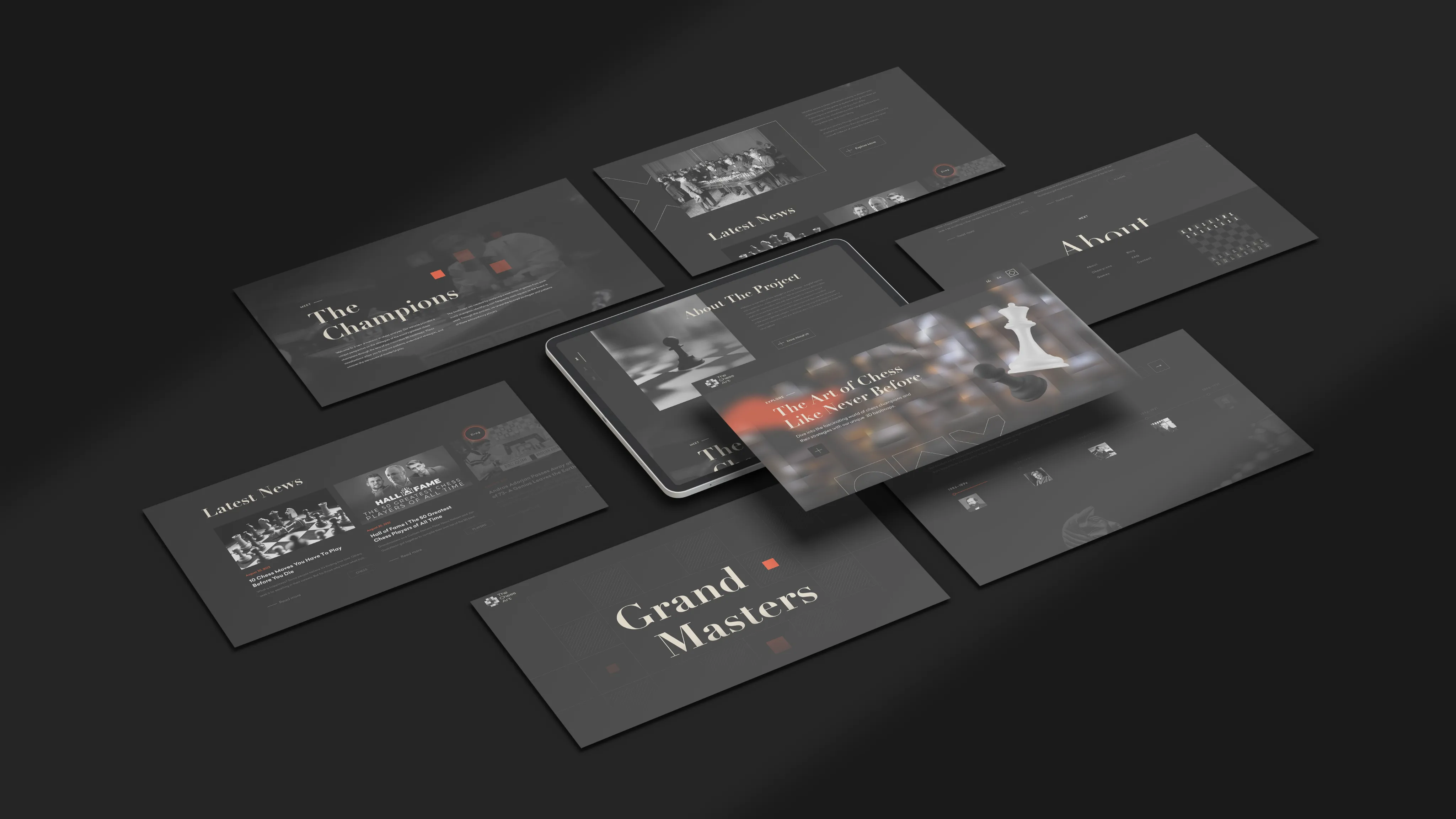
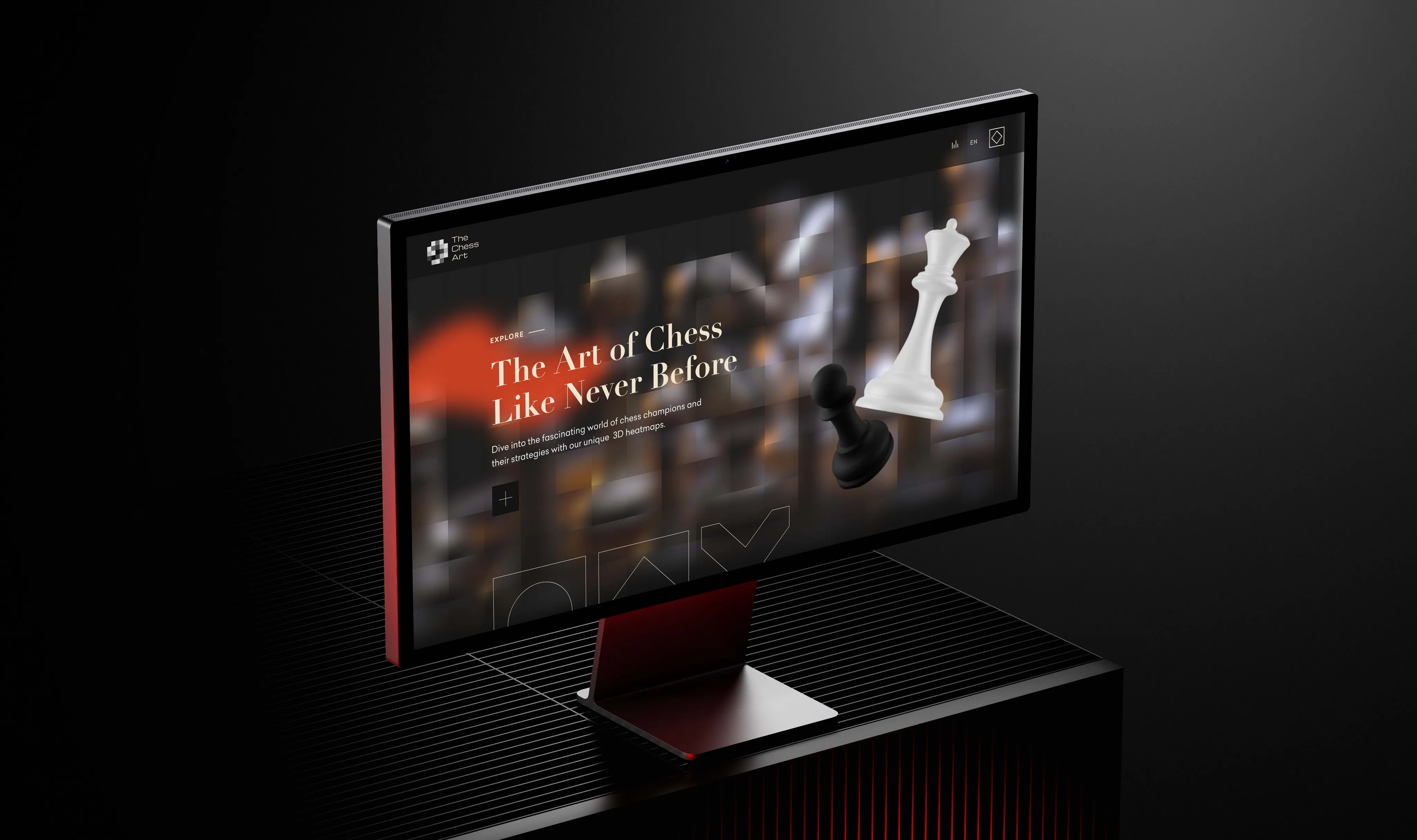
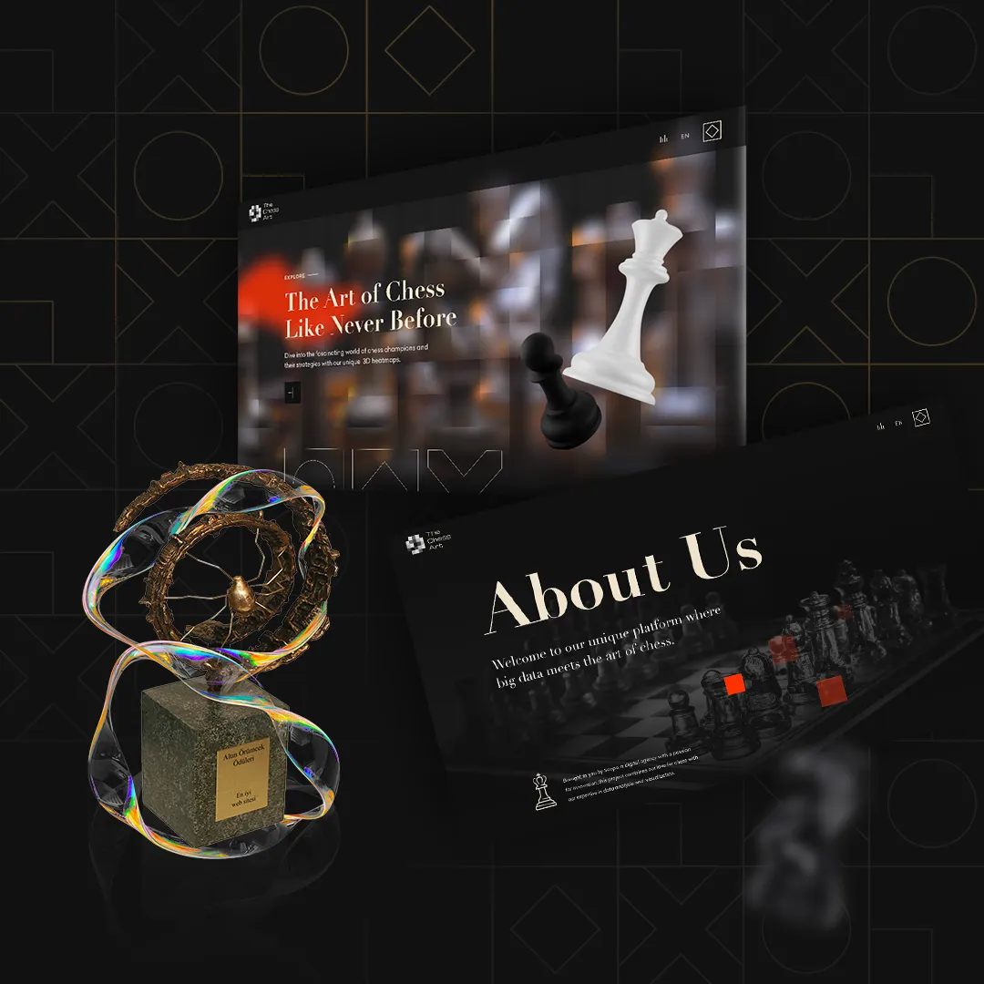
For The Chess Art, we designed a modern digital experience that highlights the aesthetics and craftsmanship of chess. Through a holistic effort spanning brand identity, the website, and the social media visual language, we aimed to pair the artisanal value of the products with a clean and intuitive interface.
- For The Chess Art, a brand selling handcrafted chess sets, we designed a clean, modern, fully responsive website and a holistic visual identity.
- Built for an aesthetics-driven boutique chess brand that wanted to present its high-craft products in the digital space as they deserve.
- The new interface increased accessibility by 30% and user engagement by 50%; a social media language aligned with the site reinforced brand recognition.
Challenge
The Chess Art was a brand built around the elegance and artistic value of handcrafted chess sets; however, its existing digital presence fell short of reflecting that craft quality. The materials, workmanship, and details of the products could not be presented visually as they deserved. Establishing a clean yet striking interface worthy of an aesthetic brand, organizing the product collection into an easily navigable structure, and ensuring it worked consistently across all screen sizes were the core challenges.
Solution
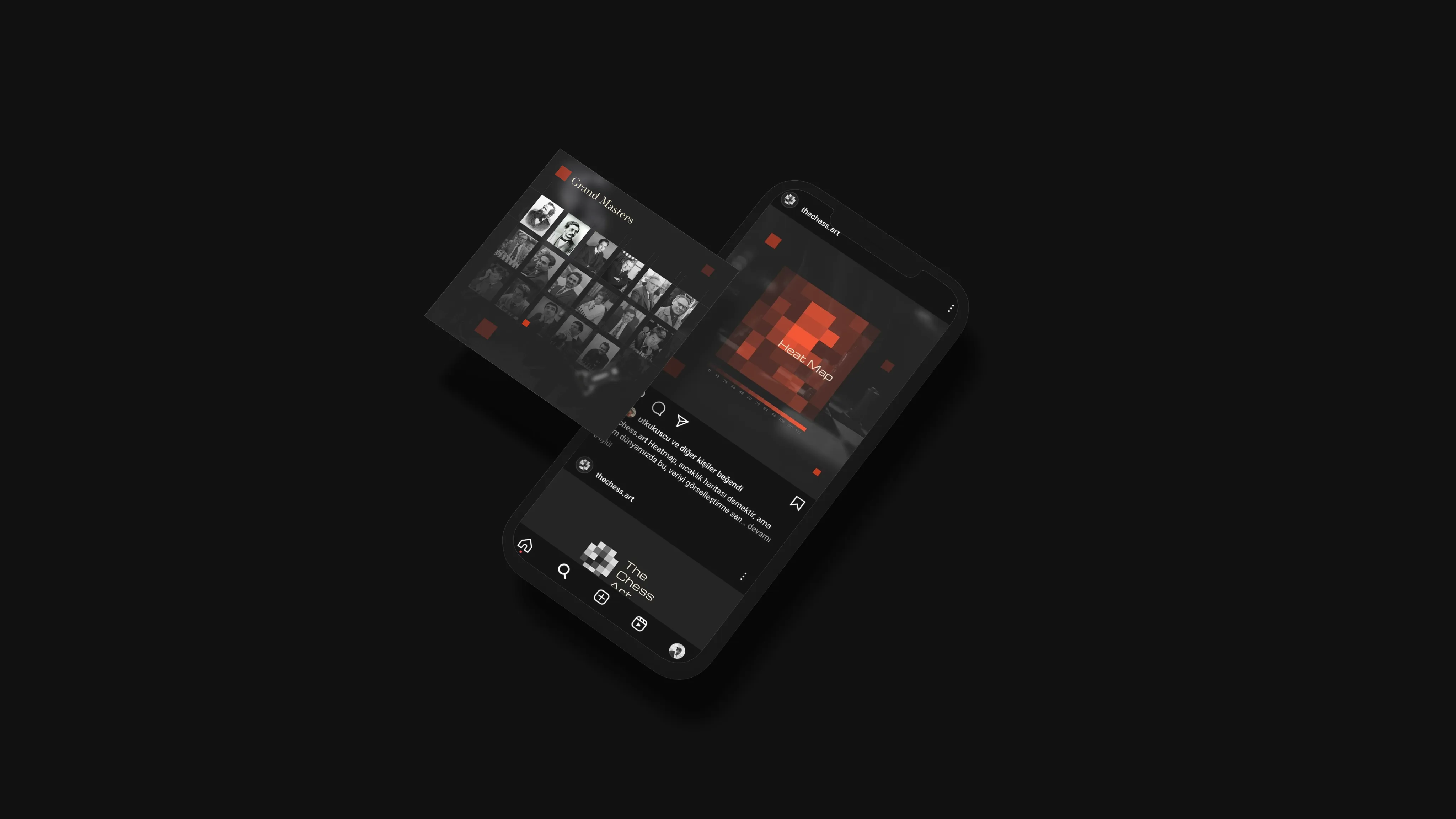
We crafted a clean and modern interface where the imagery takes center stage. A spacious layout that lets product photos breathe was combined with a balanced color and typography system evoking the black-and-white language of chess. The collection was reorganized with intuitive navigation and clear categories. The site was developed fully responsive from start to finish and tested to deliver the same fluid experience on mobile and desktop. A social media visual language consistent with the website was also created, ensuring a coherent identity across all of the brand’s touchpoints.
Results & Impact
The new interface reflected the brand’s craft value and aesthetic positioning far more powerfully. The clean layout and visual composition on the product pages made it easier for visitors to explore the collection; time spent on the site and engagement increased noticeably. The social media language aligned with the website reinforced the brand’s recognition and visual integrity. The result was a clean, fluid digital experience worthy of the brand.